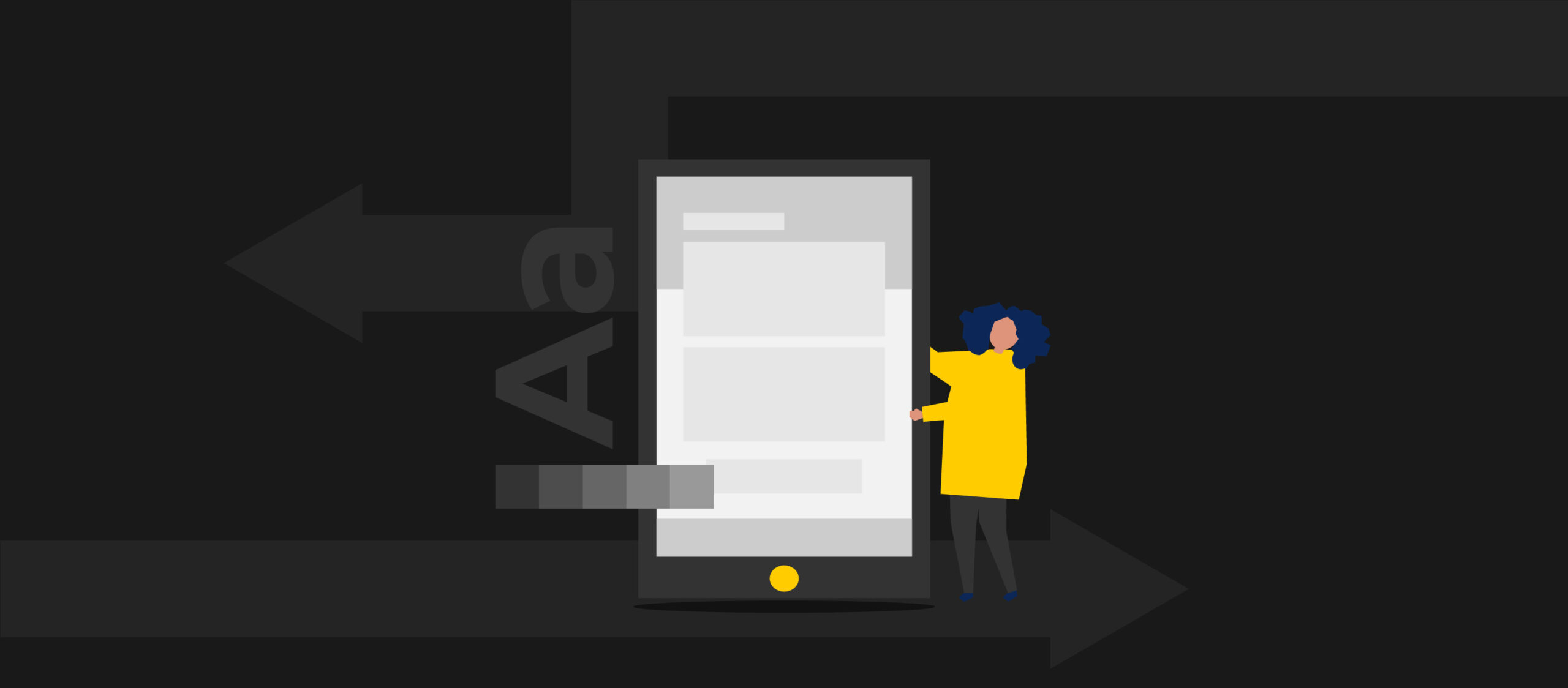
Design means a lot for a mobile app. When you start to use any mobile software, the first thing that catches the eye is the design.
The design makes people choose if they’ll use the app regularly or never use it again. When it comes down to essential elements of mobile app development to create a great app, user experience and user interface play a significant role. People like to use easy, good-looking, and fast-loading apps.
So, if you want to build a successful mobile app, your focus should be on your design. And if you need help designing your app, follow our guide.
Here is what you need to design a mobile app:
- Navigation
- Colors
- Layout Constraints
- Typography
- Iconography
1. Navigation
Navigation is the most crucial aspect of your app design and should be of your top priorities. Having the best features and excellent content on your app won’t matter if people find your app difficult to navigate. As mentioned above, people like to use easy and user-friendly navigation apps. If it takes time for users to figure out how to use your app, it will lead to app abandonment.
Prioritize and optimize important and common navigation paths that users typically follow to help them reach their end goal with as few clicks or taps as possible.
2. Colors
Every part of the designing process of your app is important, including colors. You may think the color might be the last thing to think about, but that’s not true. Choose your app’s color carefully. You should consider whether the selected color will be difficult or easy for the user. For example, mixing many colors that are in contrast with each other can distract and annoy users.
You don’t want to hurt users’ eyes while they’re using your app. Also, you want them to understand the content quickly. Therefore, make sure to use color schemes for app designs that are proven to be the right ones and easy on the eyes.
Moreover, try to put colors logically. For example, the universal color for the confirmation button is green, and the decline button is red. Make sure to make this right not to confuse users.
3. Layout Constraints
Smartphones have different shapes and sizes. Even if you develop only mobile apps for iOS or Android, you still have a lot of different screen sizes to consider. Layout constraints are essential to app design. Using layout constraints, you can set up UI design elements so that they are placed at specific distances from one another.
No matter what device they use, you want your users to have the best experience with your app. With layout constraints, you can create a good UI design that will make your app consistent across all devices and platforms.
4. Typography
Typography is a crucial factor in mobile app design. It’s the art of letters and sentence arrangement in a way that makes the text readable and visually appealing to the reader. It’s a style that affects how a text looks and feels, which can be used to communicate certain messages. So, choose typography wisely.
You may think that cool and expressive fonts are the better choice because everyone loves that, but you should know that the primary purpose of typography is legibility. Even though crazy cool fonts may look attractive in theory, they can confuse the user and make the text hard to read and understand. So, try to use simple and easy-to-read fonts.
5. Iconography
Iconography should be part of your app design as well. The icon is an image that stands out and inspires users to download your app. It can also be an excellent representation of your company’s unique brand image.
Make your iconography memorable, but do not distract users from your content. Your app has a small space on the mobile device’s screen, so try to choose an icon that is both explanatory and visually appealing.
Design affects the app’s success!
Design can be the heart of a mobile app. And the reason for this is that it has a dramatic effect on the app’s user experience.
As our designer, Sara Trifunoska, defines design: “We see the impact a good design has in our daily life. It is complex, but at the same time, it highlights the beauty in simplicity. We use different apps, and the design keeps us hooked to those apps.”


